Showing posts with label Sharpie. Show all posts

Sunday, January 29, 2012

Beauty is Skin Deep, but it's what I put on Top that's Important.


I was recently visited by the illustrious Brittney-Jade Colangelo, the beauty and brains behind DAY OF THE WOMAN and contributing writer to the Blood Sprayer. Somehow I was lucky enough to have this fetching starlet of stage and computer screen sit down in my make-up chair in the dank dungeon-style basement I should probably never call "my studio". The Una-Bomber would be claustrophobic where I try to work. Seriously, I feel like the plastic surgeon in Tim Burton's BATMAN.


I started brainstorming a look in my head of a certain juxtaposition. I wanted to balance the beauty of BJ's face with a twist of horror and carnage. I also knew I wanted it to be a balanced look, one that wasn't overpowered by one element than the other. They say beauty is skin deep so I decided to play with that and literally cut to the chase.

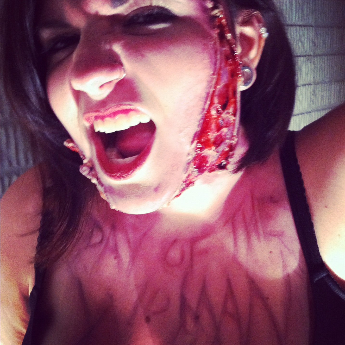
I wanted this look to be quick and simple but dynamic. I decided on using liquid latex and wanted to rely on my painting skills to impress Ms. Colangelo and my fellow readers by delivering a simple out-of-kit look. Being a theater super-star I wanted to show Brittney Jade and the rest of you what you can accomplish without the need of major prosthetics, facial appliances, or an airbrush kit.

I dabbed two areas of Brittney Jade's face with liquid latex which were allowed to dry. I took some rolled pieces of dried liquid latex and adhered them to the outsides of those areas. This would create the look of sliced skin I was after by creating a distinct line that would appear to be made of skin tissue. I then poked and prodded the layer of latex between these borders to create a ruptured blister look.


I began the arduous task of layering in color. At first I wasn't sure what this would entail. Was she a lizard like alien from V and would it be green? Was she like a T-X from TERMINATOR 3? I joked with BJ and we decided to keep it straight forward after experimenting with some colors and go with a more realistic approach.


I'm a big believer in the Rule of 3 - Use a minimum of 3 colors to blend in your look. One for a base, one for shadow, and one for contrast. I also believe that to sell your effect you have to pay the whole eye. That means if you apply something, it just doesn't go on and then you walk away; you blend it with the surrounding body parts to make the entire look flow. Go down the back, across the neck, around the leg, what ever it takes to make the look seem seamless.


Always remember that each model you work with is unique and different. No two people you work with will ever be the same. Sure you'll run into similar skin tones, body shapes, and what have you, but every one is different in how well they can stay still, how long they'll sit, the curvature of their bodies, the way they sweat, breath, talk, and a bazillion other factors that can eat up the time you need to achieve the look you want. If you want everything the same all the time, work on an assembly line.


After blending in my colors of red, purples, and grays, I added a bit of Fresh Scab. A little bit goes a long way so don't cake it on. I for one can't stand when someone spends so much time & effort on creating a look only to have it coated in too much blood. More blood is great to hear on set, but wait until you hear it called for first.


To give my look a bit of a wet/fresh look I used a very small amount of K-Y Jelly applied to the middle of my borders. It gives it a nice shine. I've tried other off-brands of lubricants, from Wal-Green's to Drug Mart, but K-Y just always seems to work the best for me. Now if I wanted a more NIGHTMARE ON ELM STREET look I would not use the K-Y and stipple on black along the edges for a burned/charred appearance.


Having one side done I was able to breeze through the other side of my model's face and match it up from reference simply by looking at the other side. I could have painted up both sides at the same time, but as I was uncertain where I was taking this look I wanted it all to flow organically. Never be afraid to experiment. you won't know what works until you try it.


It's always a matter of taking the time to blend and work with your model. If they're at ease, so will you be and it will always so in your finished product.


It's amazing to witness when an actor/actress begins to accept the change in their appearance and allows it to slip into how they develop their character. Simple actions or emotions suddenly take a dramatic change when you have half your face carved off.


I definitely liked where the look was going. I've come to accept that the way I approach things creatively and the way they end up looking are not always fundamentally aligned, but in this instance what I saw in my head was what I was delivering in reality.


The look seemed balanced on both sides. I really enjoy BJC's everyday make-up for being so simple yet elegant. Eyes and lips like that are made for glamour, but it's always a treat when they encounter something more devious.


Now a while back, a little over 2 years ago, I visited my good friend John Squires of FreddyInSpace.com with the legendary Kristy Jett and met the infamous Jesse Bartel. Over the course of the 4 Loko fueled weekend (read about it here) I somehow managed to Sharpie some spiffy website adverts on the chests of my compadres. BJC being left out of said visit, joked that she wanted the same treatment for her site. Well, who could say no to that face?


I used a dark purple and a fine tip brush to free hand out a font that I though would be readable.


I wanted to incorporate the lettering into the look of the make-up and went with trying to make it look like veins or something else underneath BJ's skin. It sounds cheesy, but Day of the Woman is something inside here trying to get out, right? Don't roll your eyes at me. We had initially discussed maybe making it look like the lettering was carved into her, but decided that this was a more interesting variation to play with instead.

I knew my lettering couldn't be elaborate or overly complex, it had to be read and flow with the rest of the look without taking away from it. After feathering out the purple to the edges, I added some black to the center of the letters and then soft sponged the colors down. I made sure to pull away from the letters from the middle and not the other way, otherwise you'd ruin the make-up and your lettering.

With a couple hardware store clip-lights I used to illuminate my corner of the world, it was time to snap some photos. Remember, I never said I was a photographer either.


Overall I was extremely pleased with how everything looked and photographed. BJ was a terrific model and sits like a champ. I really like how her simple yet effectively dynamic make-up was the basis of this look that carried with it the whole creation. I enjoy how my addition was simple, quick, and able to play well with others. Perhaps I subconsciously channeled Lucky McKee's THE WOMAN for the font, but hindsight is always 20/20. I like to think his graphic designers live inside my head, and not the other way around.

Would all of this been easier with silicone appliances and stencils and blah blah blah? Yes. Would it have been as fun? No. I honestly believe that craftsmanship is an essential component of any artistry, and in an industry where many people are being replace by computers, I strive to be a better effects make-up artist than any friggin' machine. Doubt that and that's how Skynet wins...


And for as much fun as it is to make a mess, there's always the chore of cleaning up. Remember when removing liquid latex from the skin that hot water, soap, and patience are your new best friends.


Many thanks to Brittney-Jade Colangelo for the long trek to visit and letting me play with her face. Please be sure to check out her site DAY OF THE WOMAN and tune in again to Awkward Creations as I stop being so lazy and anti-social and hopefully start posting more.

Sunday, September 18, 2011

Can't we all get along?


Bill Adcock is a many of many talents, some known, somewhat hidden, and those entirely secreted away.I'm convinced he's part Highlander. He's the brains behind Radiation-Scarred Reviews as well as a contributor to the Blood Sprayer, and B Through Z Web-Zine. He had reached out wanting to commission me for a piece of artwork, to which I replied I would do it for a trade. His request was simple enough, left to the discretion of my imagination and delivery. The only stipulations were that it was painted and contain his specifically chosen subject matter: El Santo VS Yeti.

I definitely had my work cut out for me.


Now for this piece I had to come up with a couple different ideas to figure out the best way to represent the two iconic characters. Would they be locked in battle? Who would be the victor? I tried a few sketches, but they turned out crap. That's all part of the process.


I decided to remix it like a DJ, especially being inspired by these Star Wars posters I stumbled upon one sleepless night on the Net.


Once I had an idea for the format I decided to work on how I would depict the characters. Here's some Quick Google images of El Santo and a Yeti that I went for, kinda of like a bartender just grabbing bottles.


I worked on a flat canvas board that I actually broke down and bought. It's a matte treated canvas, but it's board thin, making it easier to transport and frame due to less weight. 


It was a step by step process in trying to create these figures.


I started to outline some of the main parts in Black Sharpie.


You can see how this makes it pop more, or at least for me. I'm a sucker for sharp black lines.


Working on the lettering was one part I simply dreaded.


To break up the piece and sell it as a "fight poster" I went with some curly-q razor wire, which is a lot harder to create than you'd realize.


I decided to lighten up the blue background to add more of a pop to the piece and began finishing off the lettering and other elements with black Sharpie.


Here's the final product. I'm pretty pleased with how it turned out, especially El Santo and the balance of the piece as a whole. The eye follows from top to bottom, left to right and it succeeds in looking less like art and more like something else.

I definitely need to work on my lettering. The Sharpie makes it pop and look like a real advert. I wish it had more of a letter press look to it rather than the hand-written style, but I could probably do that more so with stencils or maybe with a computer. I guess I always take the long way home.


Now it's time to jam out El Santo style...


Tuesday, September 13, 2011

Don't talk to Strangers: GREETINGS FROM THE SHORE

So I recently unearthed some old photographs from my days in the Art Department on the film GREETINGS FROM THE SHORE. It was a pretty sweet gig, where I basically got paid to hang out on the Jersey Shore (well before anyone knew what a Snooki was). It was a super sappy love story that I believe went straight to DVD. We were there just after Labor Day and kicked of an ambitious film with a small crew, a tight schedule, and a tighter budget.

I was credited as a Set Dresser in the film, though I helped and assisted with carpentry, scenic painting and a variety of other tasks. This was definitely a get-your-hands-dirty kinda job. It was great because the weather was still mostly spectacular, we (our 5 person Art Dept.) lived in a small guest house that was a minute and a half walk to the bay were you could try your luck fishing out crabs or you could turn around, walk seven minutes and you'd hit the ocean.

We filmed at a view different locations; on the beach, along the board walk, at the Lavalette Yacht Club, and a Paramedic Garage Bay that we converted into sets. To meet out deadlines, everything had to have a natural look, even if it was entirely fabricated. We set about building flats for sets, gathering set dressing & props and tackling the project full on.


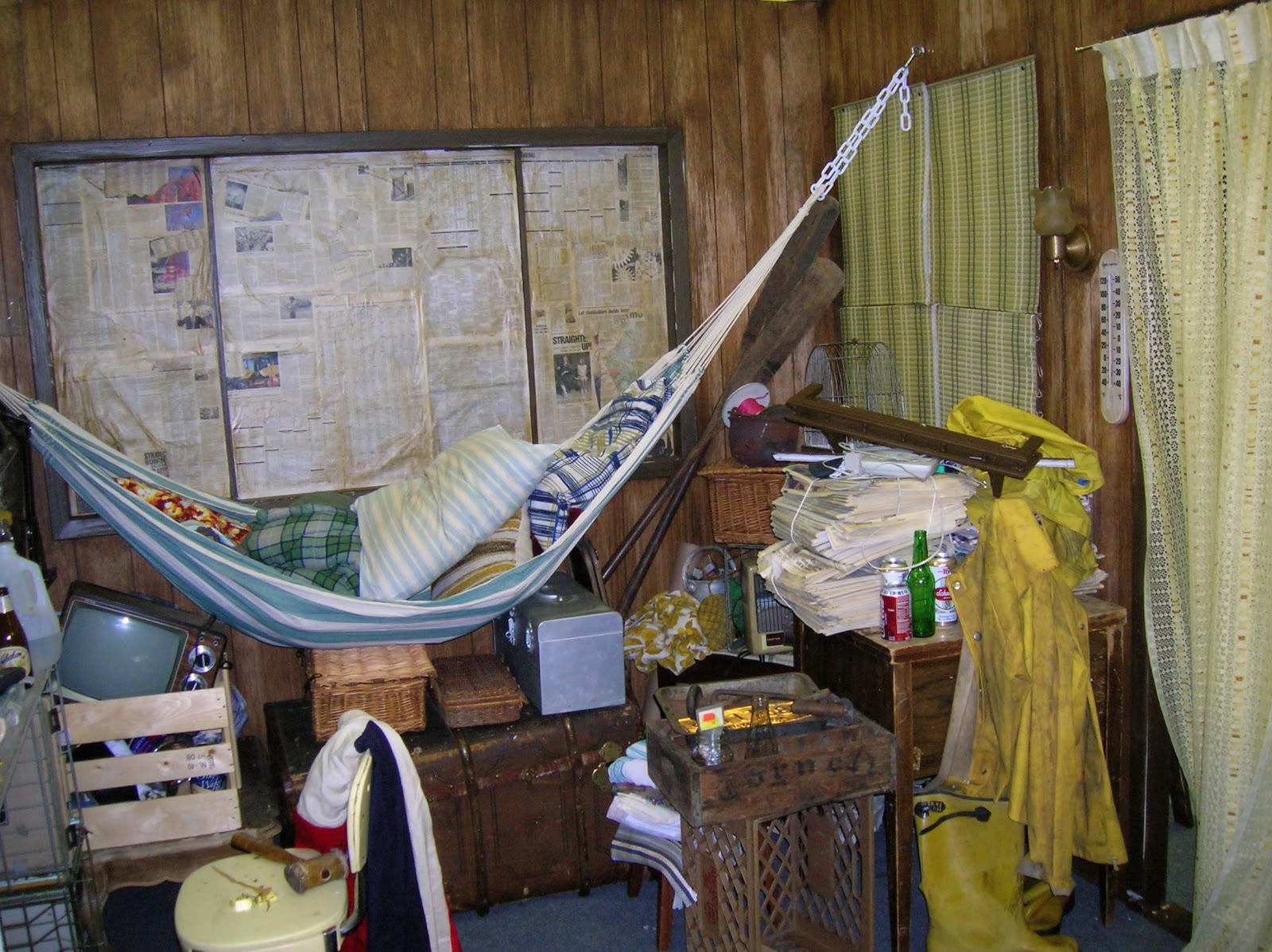
One main set we needed to build was for "Catch", played by Paul Sorvino. His character lives on a dilapidated houseboat, which meant we couldn't film there so we built it. The main idea was to sell the idea of a man that was down & out on his luck and had been for some time. I think this environment definitely reflects that.


Newspapers, which were tinted with a brown paint wash, covered the windows serving as ghetto drapes, but also hid the rest of the location around us. Here it's filled with rain gear, old trunks, and other knick knacks.The walls are a wood paneling that we slightly sanded and then spot stained to add severe aging.


One thing we also did so that this room was "sold" as the boat interior was drill pinholes in the walls and tie fishing line to things like the hats and tools, and would lightly tug on them time from time to give the illusion that they were swaying in the water.


For such a small space, you can see how much was piled into the room. I honestly believe the boat would've sunk if we would put that much set dressing on it.


Here you can see our "Jenny" leaving, but what you also have to notice is the "natural" or "practical" light sources which are a big deal in helping light a scene that would normally be dank and dark.


Here you can see the attention to detail with crushed beer cans and old dry cleaning hangers. You have to go out and get/save that stuff!


This room I am particularly proud of as it was largely constructed by myself and left to my discretion, though supervised by my bosses. This was Jenny's rented room above a Bait Shop in the storyline. It's meant to look more than a bit disheveled and left to the elements of being located near the shore. The stairwell you see goes no where, but it was nice to add the sound effect of other renters stomping up the stairs.


One part of the wall is white B-board that is painted an almost robin egg blue and then sanded to reveal the white underneath. From that I added layers of dark green and brown was to give the appearance of water damage.


This was done to the particle board was as well. The electrical conduit you see is all fake as well, but it helps sell the effect.


We built a window bench and discolored that as well with sanding and by scratching and carving the names of my department into the wood.


Homely elements balanced with some of the dankness helps sell the illusion of the trouble with the character. Even just tossing some wardrobe about really helps the audience belive that the character bleongs in this space.


One thing I really like was the water stain I painted on the ceiling. It's a brown paint water wash, painted inwards in a circular pattern. This was done with combination of brushwork and sponging.


These flowers? They were fresh that day, donated from a local florist. I however took some grey and off-green spray paint and made them look like they had been dead for weeks.


One joke was that Catch would have a pin-up girl on his boat, so I took up the challenge and a scrap piece of particle board. I used an old Vargas girl as inspiration and made sure to age it with a watered down brown paint wash.


Here's a look at the whole portrait. Most folks were pleased with it, but I wanted to work on it longer, I'm still not very good at the human figure. This was all done with acrylic paint and black Sharpie marker. This is a perfect example of why Vargas is an icon and I write a blog.


One running joke written into the script was how the Yacht club always, always, ALWAYS, had Scrod on the menu. I did up a couple of chalk sandwich boards throughout the film.


Here's a couple of close-ups. This was all done with standard sidewalk chalk.


Here's another closer peek.


Another set we had to build was one of the boarding rooms were the hunky, but misunderstood foreign love interest stays. Here we used cheap contact paper as wallpaper and sponged it with brown paint wash for a dirty, weathered look.


The same blue B-board is carried through to imply that this room is in the same building since it has similar decor.


One thing I particularly liked was the square stains that would be left behind from paintings or photographs on the wall. Of course, that's simply paint.


Here you can see the back side of the flat, making the room completely detachable. Camera and lighting are able to move in and freely get a wide range of motion in capturing the scene.


And of course here's the famous water stained ceiling. We ended up using this anytime we would see the ceiling in a shot of the boarding rooms, so if you'll look closely, you'll notice the same stain dance around to numerous rooms and corners!


This was a really fun and challenging project to work on and the crew was fantastic, turning out top-notch, quality work constantly, day in & day out. It was the last feature film that I would work on from start to finish in the Art Department. Regardless it's a fun little date flick that will probably help you get to 2nd base at the very least.


And I know you're dying to see the trailer, so here goes....


And if you actually watch the film, you see a cameo of yours truly, as I got sucked into a party scene.