Bill Adcock is a many of many talents, some known, somewhat hidden, and those entirely secreted away.I'm convinced he's part Highlander. He's the brains behind Radiation-Scarred Reviews as well as a contributor to the Blood Sprayer, and B Through Z Web-Zine. He had reached out wanting to commission me for a piece of artwork, to which I replied I would do it for a trade. His request was simple enough, left to the discretion of my imagination and delivery. The only stipulations were that it was painted and contain his specifically chosen subject matter: El Santo VS Yeti.
I definitely had my work cut out for me.
Now for this piece I had to come up with a couple different ideas to figure out the best way to represent the two iconic characters. Would they be locked in battle? Who would be the victor? I tried a few sketches, but they turned out crap. That's all part of the process.
I decided to remix it like a DJ, especially being inspired by these Star Wars posters I stumbled upon one sleepless night on the Net.
Once I had an idea for the format I decided to work on how I would depict the characters. Here's some Quick Google images of El Santo and a Yeti that I went for, kinda of like a bartender just grabbing bottles.
I worked on a flat canvas board that I actually broke down and bought. It's a matte treated canvas, but it's board thin, making it easier to transport and frame due to less weight.
It was a step by step process in trying to create these figures.
I started to outline some of the main parts in Black Sharpie.
You can see how this makes it pop more, or at least for me. I'm a sucker for sharp black lines.
Working on the lettering was one part I simply dreaded.
To break up the piece and sell it as a "fight poster" I went with some curly-q razor wire, which is a lot harder to create than you'd realize.
I decided to lighten up the blue background to add more of a pop to the piece and began finishing off the lettering and other elements with black Sharpie.
Here's the final product. I'm pretty pleased with how it turned out, especially El Santo and the balance of the piece as a whole. The eye follows from top to bottom, left to right and it succeeds in looking less like art and more like something else.
I definitely need to work on my lettering. The Sharpie makes it pop and look like a real advert. I wish it had more of a letter press look to it rather than the hand-written style, but I could probably do that more so with stencils or maybe with a computer. I guess I always take the long way home.
So I recently unearthed some old photographs from my days in the Art Department on the film GREETINGS FROM THE SHORE. It was a pretty sweet gig, where I basically got paid to hang out on the Jersey Shore (well before anyone knew what a Snooki was). It was a super sappy love story that I believe went straight to DVD. We were there just after Labor Day and kicked of an ambitious film with a small crew, a tight schedule, and a tighter budget.
I was credited as a Set Dresser in the film, though I helped and assisted with carpentry, scenic painting and a variety of other tasks. This was definitely a get-your-hands-dirty kinda job. It was great because the weather was still mostly spectacular, we (our 5 person Art Dept.) lived in a small guest house that was a minute and a half walk to the bay were you could try your luck fishing out crabs or you could turn around, walk seven minutes and you'd hit the ocean.
We filmed at a view different locations; on the beach, along the board walk, at the Lavalette Yacht Club, and a Paramedic Garage Bay that we converted into sets. To meet out deadlines, everything had to have a natural look, even if it was entirely fabricated. We set about building flats for sets, gathering set dressing & props and tackling the project full on.
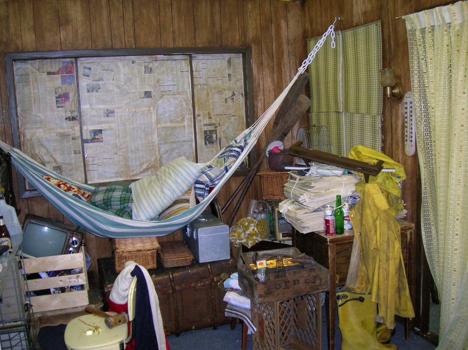
One main set we needed to build was for "Catch", played by Paul Sorvino. His character lives on a dilapidated houseboat, which meant we couldn't film there so we built it. The main idea was to sell the idea of a man that was down & out on his luck and had been for some time. I think this environment definitely reflects that.
Newspapers, which were tinted with a brown paint wash, covered the windows serving as ghetto drapes, but also hid the rest of the location around us. Here it's filled with rain gear, old trunks, and other knick knacks.The walls are a wood paneling that we slightly sanded and then spot stained to add severe aging.
One thing we also did so that this room was "sold" as the boat interior was drill pinholes in the walls and tie fishing line to things like the hats and tools, and would lightly tug on them time from time to give the illusion that they were swaying in the water.
For such a small space, you can see how much was piled into the room. I honestly believe the boat would've sunk if we would put that much set dressing on it.
Here you can see our "Jenny" leaving, but what you also have to notice is the "natural" or "practical" light sources which are a big deal in helping light a scene that would normally be dank and dark.
Here you can see the attention to detail with crushed beer cans and old dry cleaning hangers. You have to go out and get/save that stuff!
This room I am particularly proud of as it was largely constructed by myself and left to my discretion, though supervised by my bosses. This was Jenny's rented room above a Bait Shop in the storyline. It's meant to look more than a bit disheveled and left to the elements of being located near the shore. The stairwell you see goes no where, but it was nice to add the sound effect of other renters stomping up the stairs.
One part of the wall is white B-board that is painted an almost robin egg blue and then sanded to reveal the white underneath. From that I added layers of dark green and brown was to give the appearance of water damage.
This was done to the particle board was as well. The electrical conduit you see is all fake as well, but it helps sell the effect.
We built a window bench and discolored that as well with sanding and by scratching and carving the names of my department into the wood.
Homely elements balanced with some of the dankness helps sell the illusion of the trouble with the character. Even just tossing some wardrobe about really helps the audience belive that the character bleongs in this space.
One thing I really like was the water stain I painted on the ceiling. It's a brown paint water wash, painted inwards in a circular pattern. This was done with combination of brushwork and sponging.
These flowers? They were fresh that day, donated from a local florist. I however took some grey and off-green spray paint and made them look like they had been dead for weeks.
One joke was that Catch would have a pin-up girl on his boat, so I took up the challenge and a scrap piece of particle board. I used an old Vargas girl as inspiration and made sure to age it with a watered down brown paint wash.
Here's a look at the whole portrait. Most folks were pleased with it, but I wanted to work on it longer, I'm still not very good at the human figure. This was all done with acrylic paint and black Sharpie marker. This is a perfect example of why Vargas is an icon and I write a blog.
One running joke written into the script was how the Yacht club always, always, ALWAYS, had Scrod on the menu. I did up a couple of chalk sandwich boards throughout the film.
Here's a couple of close-ups. This was all done with standard sidewalk chalk.
Here's another closer peek.
Another set we had to build was one of the boarding rooms were the hunky, but misunderstood foreign love interest stays. Here we used cheap contact paper as wallpaper and sponged it with brown paint wash for a dirty, weathered look.
The same blue B-board is carried through to imply that this room is in the same building since it has similar decor.
One thing I particularly liked was the square stains that would be left behind from paintings or photographs on the wall. Of course, that's simply paint.
Here you can see the back side of the flat, making the room completely detachable. Camera and lighting are able to move in and freely get a wide range of motion in capturing the scene.
And of course here's the famous water stained ceiling. We ended up using this anytime we would see the ceiling in a shot of the boarding rooms, so if you'll look closely, you'll notice the same stain dance around to numerous rooms and corners!
This was a really fun and challenging project to work on and the crew was fantastic, turning out top-notch, quality work constantly, day in & day out. It was the last feature film that I would work on from start to finish in the Art Department. Regardless it's a fun little date flick that will probably help you get to 2nd base at the very least.
And I know you're dying to see the trailer, so here goes....
And if you actually watch the film, you see a cameo of yours truly, as I got sucked into a party scene.
The world of the music video is an odd one and I have bumped into it in my artistic endeavors. It's really interesting to see how cheaply and quickly they throw these things together. Here are some old shots I recently found from a music video I did years ago for Waverly Films. I was the Art Director under the Production Designer Patrick McGowan, whom I had met working on the horror flick UNHOLY. Our challenge was to turn a shitty warehouse space into a shitty medical facility for white-coated lab rats and hot chicks to dance about. While you're more focused on the action, you forget I had to track down medical supplies from almost 3 different rental houses and deal with all the assholes that push numbers and papers about what constitutes a full day rental vs. a half day rental.
What follows is the hot mess I barely remember as:
Joey Negro's "Make A Move On Me"
The extras in this were spot on. This looks like something out of a B-movie from the '50s. I keep waiting for a man in a gorilla suit to jump in with a cosmic ray gun.
Here you can see the special call-in dials and instruments and all kind of do-dads that sell the scene. Some worked, some didn't, we weren't quite sure what some of them even did, but damn if it didn't look official.
There's a microscope, and a sink and a whatever the hell. I know that's the periodic table. This is all important in selling the mind's eye that this space is real and actually exists. This is all smoke and mirrors. It's a porno set without the sex. It's pretend for grown-ups.
You don't even wanna know what's in that jar. These are all props that seem to be absolutely necessary at the very last minute, not matter what, for whatever odd-ball reason. I've seen it a hundred times before. Now imagine driving around New Jersey, Manhattan, Queens, Brooklyn, and the Bronx with all this crap bouncing around in your rented cargo van as you go to Home Depot for the 37th time to buy more paint brushes and God knows what else.
One of the running gags was to over-label everything with red printed labels. We literally had them everywhere, advertising the most obvious of the obvious. We manipulated he machinery for close-ups and you as the audience are never the wiser that it barely works at all.
Here's a little behind the scenes shot as the crew sets the action and everyone pretends to be really important. Here you can see and realize that all four walls of this "room are completely removable. We built it so that the whole set could literally move throughout the warehouse, depending on the need for lighting.
So this DJ, Joey Negro, couldn't make it for the video, so this gigantic paper mache mask is meant as his cameo. Of course that got a label too.
Here's the hero of our story; a lowly test subject a the whim of desire and circumstance. A nice guy, but damn if those electrodes didn't keep falling off all damn day. And every time I see this I can't help but think of that one scene at the start of GHOSTBUSTERS.
It was actually kind of cool to see all these different gals gyrate in freezing warehouse, while I pretended to adjust electrodes and whatever. Sadly their efforts were all for not when I heard through the grapevine that the record company thought the gals weren't sexy enough and digitally replaced them.
Waverly Films has gone on to do more music videos, play with puppets, sell Doritos, etc.
Any way, here's the video, you be the judge....
If you're still interested, I worked on these other music videos purely from a production standpoint and had no artistic input whatsoever.
So once upon a time I worked with the impeccable David Kalahiki and helped turn Jon Benjamin into Bernie Madoff. Click here to catch up on that story.
I recently found some photographs that beg for another story. Well, I also had assisted David on a "high end/high concept" fashion shoot for Arnaldo Vargas. We had arrived at this photographer's apartment/studio prepared to do 3+ looks for one male model and one female model.
Wardrobe was being donated on the condition they'd be returned in the same condition they were lent from some boutique where a belt costs half your rent. That's something to worry about when you're rushing about with fabric staining creams & powders.
So the female model flaked out and didn't show the day of the shoot so we were left with only a male model that had to leave by 5pm for his waiter/catering gig. I forgot to mention we started all this at about 9am. The concept behind the look of the shoot was to create a post modern/MAD MAX meets New York Couture with a pseudo-punk rock flare, which was eventually titled "Apocalipchic". Personally I think it looked like Michael Alig on his way to some Varsity sports practice. The other outfits provided a wider range of the make-up styles attempted in harsher geometric shapes and tribal styles, and I don't think the photos that follow adequately represent David's true talents as a make-up artist, but the photographer was happy, the model was comfortable, and if the client is happy - that's all that really matters. And plus I had a unique opportunity to help and learn.
David & I were basically flying by the seat of our pants trying to create different looks from the limited wardrobe and the minimal number of locations afforded us from the studio and apartment. What you don't see listed is our adventures to a rat infested basement and a freight elevator that was made of rust holding hands. David was a true pro, through and through, working within the time constraints the certain looks desired, and even technical issues with the photography equipment as I frantically tried to help him in the best ways I could figure out.
I think the dichotomy of having a female model to play off of the male model would have made the shoot a bit more interesting and provided a flare of variety, especially in pairings for action and color contrasts. But in any endeavor, you do what you can with what you have.
Though I have yet to work again in the world of fashion, I think it was a valuable experience in helping to create and craft not just an image, but the allure of the what is contained in its subject matter. There's action and drama, and it's all from one still, a single frame. Coming from the world of film this puts the principles of advertising and promotion further into focus and also how easily all of much can be manipulated.
I had a blast working with David, always have. I highly recommend his services if you're in need in the New York area. You can check out Arnaldo Vargas' Photography by clicking here.
You may remember a little while back when I worked a short film, "ReGift Demon" for Yellow Line Pictures where I needed to create a classic fire-engine red Devil. You can click here to catch up on the techniques if you missed out.
After making its rounds with a few festivals and screenings, the short is now available for your viewing pleasure on the Internet.
Enjoy the show.
I'm quite pleased with how the look came out; subtle but definitely dynamic without being over the top. You can click here for a listing of the full cast & crew.