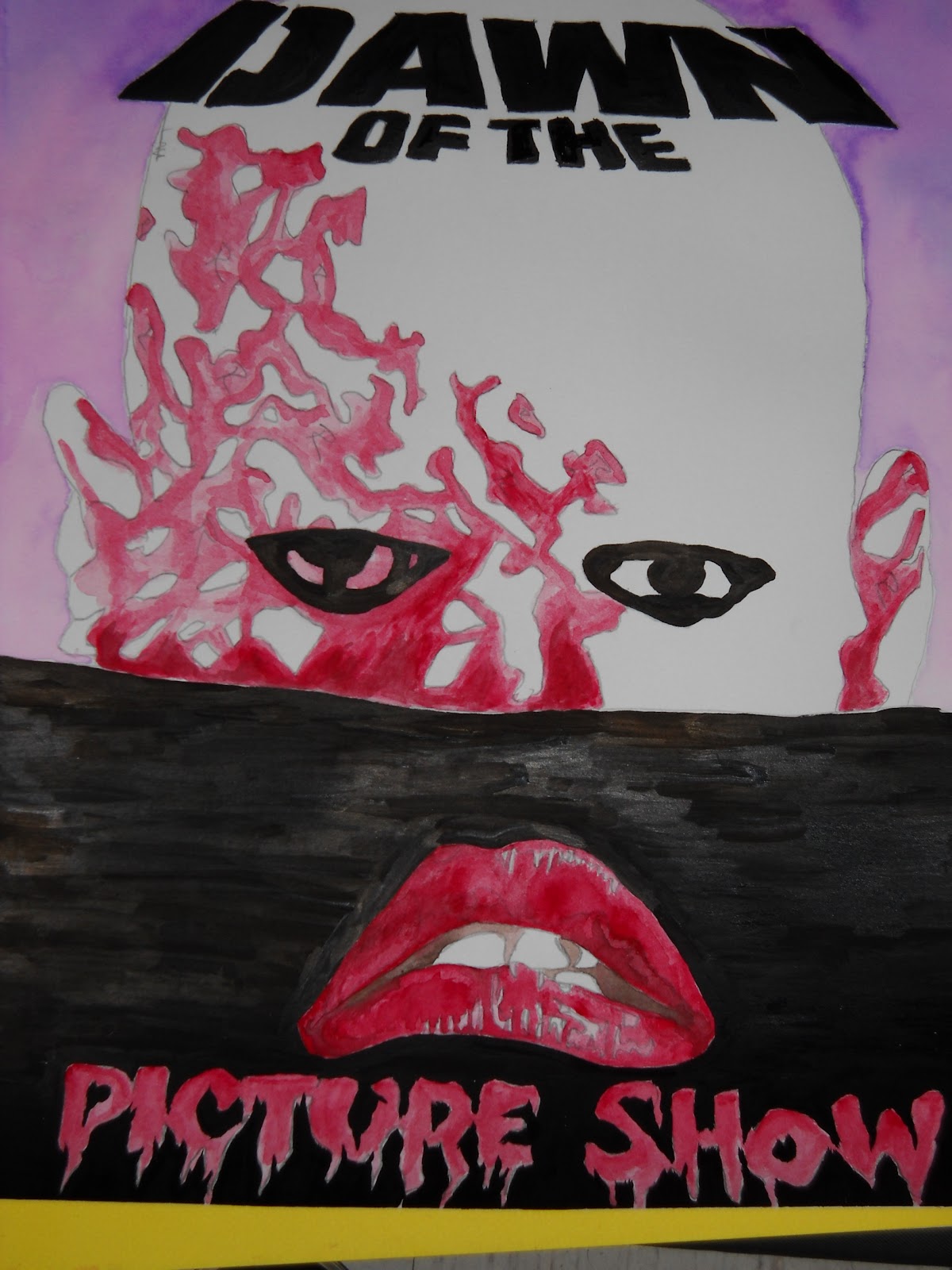
A little while back I held a contest on my other blog ZforZombies.com where the winner would receive a piece of original artwork. I've held this contest before and it's always a fun challenge to interpret what the winners want into an original piece of artwork. Joe O'Connor, the man behind Oduction Production's Midnight Time Warp, won the last prize I offered and wanted something that combined his two cinematic loves - DAWN OF THE DEAD and THE ROCKY HORROR PICTURE SHOW. I thought long and hard about how to approach the piece, of possibly combining characters in a scene and the appropriate ways to initiate a cross-over. Ultimately I decided to channel the iconic imagery used to market these films into one cohesive product.
I sketched out the head over the horizon piece from DAWN OF THE DEAD and its stencil like font and decided to implement the lips and drippy font from THE ROCKY HORROR PICTURE SHOW. This was all done on Bristol board. The idea was to meld both pieces into an almost movie poster look. You can see little "R"s and "BL"s on the face to help me discern which areas would be painted red & black. I found this to be a big help, almost like my own paint-by-numbers kit.
I decided to use watercolors for a nice blended effect to capture a photo-realism with the lips and to give a warbled hue for the top of the piece as well. I used shade of brown for the inside of the mouth as black would make it look lost in the background later on.
I chose purple for the background to off-set the red that I would use to tie the piece together. I knew that working with a limited color scheme was the only way to truly make the piece "pop".
I went in with India ink and a brush to drop a layer of true black across the piece. This was a little tricky with the lettering, but I managed to pull it off. I doubt the piece would be as eye catching if I had just used black watercolor.
All inked up, you can see my horizon line is a bit wonky. Such is the peril of drawing straight lines without a ruler. To fix this I laid a strip of blue painter's taper across the piece and pressed firmly so that no ink would bleed out. I then took my brush and leveled out all my uneven areas.
After I finished with the ink, I went back over and erased my pencil lines, and the segments where I had marked for color. The thing I didn't account for was that the water color over top of the pencil made it a little more difficult to remove. Once I rubbed out the pencil marks, I had to go back over some areas for color, but this added a nice element of shading to it all. Notice the gradient of purple from top to bottom.
Here it is, all done up. I particularly enjoy how the lips seem to be a part of the zombie head. The horizon line plays a trick on your eyes as it attempts to separate the two images that I have juxtaposed. The flash from my camera picks up the brush strokes from the ink, but they're unnoticable to the naked eye. I think the combination of text and fonts plays a really nice role in the overall aesthetic. I sincerely hope that Joe enjoys the piece as it gave me more exercise with watercolors and inking. Be sure to check out ZforZombies.com for future contests!


Thanks man!
ReplyDelete