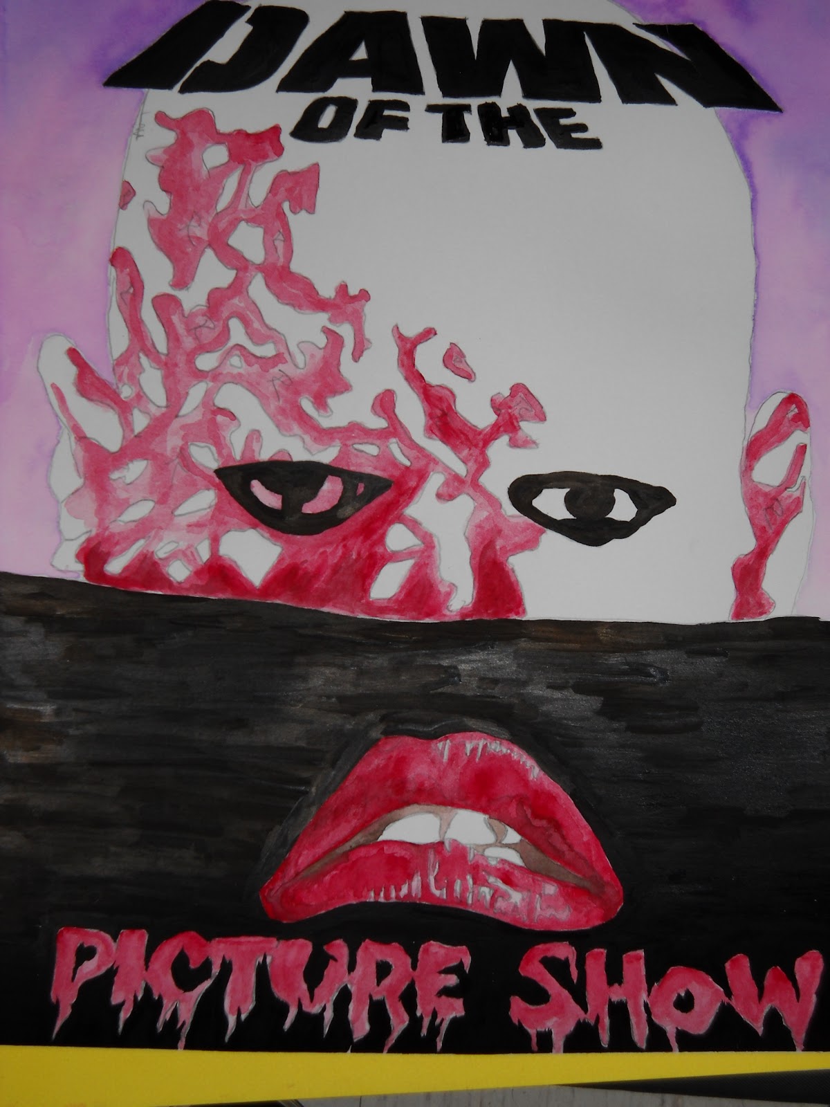
A little while back I held a contest on my other blog ZforZombies.com where the winner would receive a piece of original artwork. I've held this contest before and it's always a fun challenge to interpret what the winners want into an original piece of artwork. Joe O'Connor, the man behind Oduction Production's Midnight Time Warp, won the last prize I offered and wanted something that combined his two cinematic loves - DAWN OF THE DEAD and THE ROCKY HORROR PICTURE SHOW. I thought long and hard about how to approach the piece, of possibly combining characters in a scene and the appropriate ways to initiate a cross-over. Ultimately I decided to channel the iconic imagery used to market these films into one cohesive product.
I sketched out the head over the horizon piece from DAWN OF THE DEAD and its stencil like font and decided to implement the lips and drippy font from THE ROCKY HORROR PICTURE SHOW. This was all done on Bristol board. The idea was to meld both pieces into an almost movie poster look. You can see little "R"s and "BL"s on the face to help me discern which areas would be painted red & black. I found this to be a big help, almost like my own paint-by-numbers kit.
I decided to use watercolors for a nice blended effect to capture a photo-realism with the lips and to give a warbled hue for the top of the piece as well. I used shade of brown for the inside of the mouth as black would make it look lost in the background later on.
I chose purple for the background to off-set the red that I would use to tie the piece together. I knew that working with a limited color scheme was the only way to truly make the piece "pop".
I went in with India ink and a brush to drop a layer of true black across the piece. This was a little tricky with the lettering, but I managed to pull it off. I doubt the piece would be as eye catching if I had just used black watercolor.
All inked up, you can see my horizon line is a bit wonky. Such is the peril of drawing straight lines without a ruler. To fix this I laid a strip of blue painter's taper across the piece and pressed firmly so that no ink would bleed out. I then took my brush and leveled out all my uneven areas.
After I finished with the ink, I went back over and erased my pencil lines, and the segments where I had marked for color. The thing I didn't account for was that the water color over top of the pencil made it a little more difficult to remove. Once I rubbed out the pencil marks, I had to go back over some areas for color, but this added a nice element of shading to it all. Notice the gradient of purple from top to bottom.
Here it is, all done up. I particularly enjoy how the lips seem to be a part of the zombie head. The horizon line plays a trick on your eyes as it attempts to separate the two images that I have juxtaposed. The flash from my camera picks up the brush strokes from the ink, but they're unnoticable to the naked eye. I think the combination of text and fonts plays a really nice role in the overall aesthetic. I sincerely hope that Joe enjoys the piece as it gave me more exercise with watercolors and inking. Be sure to check out ZforZombies.com for future contests!
Showing posts with label Inking. Show all posts
Monday, March 14, 2011
Monday, November 29, 2010
Idle Hands and the Devil's Workshop: Part 2
Consider this the sequel to my cadre of artistic endeavors.
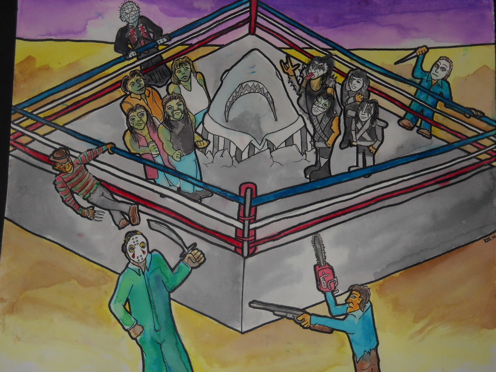
So I held a Art Contest Giveaway on my Twitter Zach for Zombies a while back and Geof of The Man Cave won. His prize was an original piece of artwork of anything he wanted. After spending a day drinking heavily watching sports he came up with my task; to create a wrestling match between the HARD ROCK ZOMBIES and the band KISS with JAWS (yes, the shark) as the referee. This death match would also have Pinhead of HELLRAISER, Freddy Krueger of NIGHTMARE ON ELM STREET, Jason Vorhees of FRIDAY THE 13TH, Ash of EVIL DEAD fame, and Mike Myers of HALLOWEEN as the lumberjacks outside the ring, poised to annihilate anyone that gets tossed over the ropes. Not a small task to accomplish by any means.
I started a few sketches in pencil on Bristol board, trying to figure out the best perspective to include all of these figures in one unified space. I knew the angle and the size of it all would determine how to proceed. I ultimately decided to tackle it straight on and use that very same angle. I went in after some sizing and started to add the details that would make each figure instantly recognizable.
Now I could understand the state of mind Geof was in when he thought this up, or I at least tried. I decided to use watercolors to give it a hazy, pseudo-comic book vibe. The trickiest part was depicting each character in it's limited scale and achieving each look that makes them so iconic. Watercolors are fairly unforgiving, but I enjoy working with the controlled chaos of how each color will ebb & flow. I then outlined different parts in Sharpie and fine point pen.
The piece is gritty and pretty ridiculous. Despite the challenge of creating it and the time it took, it was a lot of fun to experiment with such a mash-up of Geof's favorite films and influences and deliver a worthy prize. To do it again, I may would have tried acrylic or maybe even crayon.... You can check out Geof's unveiling post with video at The Man-Cave by clicking here.
John Squires the beard and brains behind Freddy in Space commissioned me a while back on our field trip to Coney Island to see the Bruce Campbell Burlesque Tribute Show. He wanted a piece of horror themed artwork to decorate his new homestead that he had just moved into with his lovely girlfriend Jen. Johnny wanted a piece that celebrated the Clint Howard schlock fest known as ICE CREAM MAN. I said yes, of course and the wheels started to turn.
In researching how I wanted to craft this piece I remember I had the seat from an old wooden chair from college. The chair broke, but in such a way that the seat came out free and clear and I kept it knowing I was going to have to create something. It wasn't until John's request that I knew the genesis of this project. I would now embark on carving my first wood cut ever.
I used my girlfriend's carving tools to etch out a picture of Clint from the cover art of the film. I knew that I would have to think backwards in two ways with my work. 1) Whatever I carved away would be the negative space left behind, almost like drawing in reverse. 2) Anything I would use for this would be a reverse image when I pulled any prints off of it. Both of these things are something that's a lot harder to grasp in actual execution.
I got the carving to just about where I wanted it. The tricky thing with the seat was that I was trying to keep the image centered in the circular recess of the chair seat, you know the part you put your ass in. Then covered a small piece of cardboard I tore from a shipping box in smoothed aluminum foil and taped the edges underneath. I then squeezed out a quarter size of Speedball printing ink and used a small hand roller to start an even flowing layer of ink. You can find the ink and roller at just about any art store, and the ink has the same consistency as acrylic tube paint. Then I took the roller with an even coat of ink on it and rolled onto the wood. I had to be mindful of the divot, and I would suggest next time of only using a a FLAT board, but I digress. I have never pulled prints before, so there's a few valuable lessons I learned. The heavier stock paper you use is a bit more forgiving for beginners. I had a thinner piece tear on me as I was pulling it off. The thinner stock is a lot nicer for framing so there's the draw, it just requires a bit more patience and a steadier hand. You can find all kinds of specialty paper for printing at the art store as well. You don't want to go overboard with the ink as it will come out gloppy and too dark. Too light with the ink and it doesn't come out all the way. Some artists chase after a "Ghost Print", which is when you pull one print and have enough residual ink left over to simply apply another piece of paper.
I ended up pulling 9 prints in total, my favorite number. I decided that I was going to leave 3 as they were pulled and I decided to alter the remain 6 with spray paint and Sharpie to add a bit of variety.
The 3 I left unaltered are labeled #1-3 and signed. The others are all unique one of a kind variants. the last one actually has a hole in it that I plugged by gluing my business card on the back side as a way to double sign my work. Each of the altered prints are titled "Eye Scream #1-6" respectively.
Once I let the ink dry on the wood cut, I wanted to create a truly one and only piece. I was effectively going to destroy my plate, ensuring that no other prints could ever be pulled from it. I was going to paint over the seat in acrylic paint, which dries to a almost hard plastic. I set about building the flesh tones and then adding the other elements from the movie cover art that wasn't incorporated into the carving.
I had added the lightning and a graded blue background to make the image pop. The initial idea was to title the piece in red, with the drips from the bloody ice cream cone feeding into the letters, but I scratch that as I felt it would get lost in translation. I instead opted for a lime/mutant green that I wrote in with a paint marker, a graffiti artists best friend. The green, I feel, really adds a touch of late 80s sensibility to it. The other issue I was having was the eyes, which I went back over with white acrylic.
Here's the finished piece, outlined in sharpie which proved like driving over road bumps when drawing the borders and carved areas. The title is smeared and drippy on purpose with a festering look about it. The whole project was a lot of fun to create, and I feel like I pushed myself into a new medium to deliver what was expected of me. This was my first commission piece so I felt obligated to go above and beyond. This is meant to be hung on the wall and Johnny also received all 9 prints with this piece.
You can check out Johnny's post with photos at Freddy in Space by clicking here. Rumor has it that he be holding a giveaway of his own....
So I held a Art Contest Giveaway on my Twitter Zach for Zombies a while back and Geof of The Man Cave won. His prize was an original piece of artwork of anything he wanted. After spending a day drinking heavily watching sports he came up with my task; to create a wrestling match between the HARD ROCK ZOMBIES and the band KISS with JAWS (yes, the shark) as the referee. This death match would also have Pinhead of HELLRAISER, Freddy Krueger of NIGHTMARE ON ELM STREET, Jason Vorhees of FRIDAY THE 13TH, Ash of EVIL DEAD fame, and Mike Myers of HALLOWEEN as the lumberjacks outside the ring, poised to annihilate anyone that gets tossed over the ropes. Not a small task to accomplish by any means.
I started a few sketches in pencil on Bristol board, trying to figure out the best perspective to include all of these figures in one unified space. I knew the angle and the size of it all would determine how to proceed. I ultimately decided to tackle it straight on and use that very same angle. I went in after some sizing and started to add the details that would make each figure instantly recognizable.
Now I could understand the state of mind Geof was in when he thought this up, or I at least tried. I decided to use watercolors to give it a hazy, pseudo-comic book vibe. The trickiest part was depicting each character in it's limited scale and achieving each look that makes them so iconic. Watercolors are fairly unforgiving, but I enjoy working with the controlled chaos of how each color will ebb & flow. I then outlined different parts in Sharpie and fine point pen.
The piece is gritty and pretty ridiculous. Despite the challenge of creating it and the time it took, it was a lot of fun to experiment with such a mash-up of Geof's favorite films and influences and deliver a worthy prize. To do it again, I may would have tried acrylic or maybe even crayon.... You can check out Geof's unveiling post with video at The Man-Cave by clicking here.
John Squires the beard and brains behind Freddy in Space commissioned me a while back on our field trip to Coney Island to see the Bruce Campbell Burlesque Tribute Show. He wanted a piece of horror themed artwork to decorate his new homestead that he had just moved into with his lovely girlfriend Jen. Johnny wanted a piece that celebrated the Clint Howard schlock fest known as ICE CREAM MAN. I said yes, of course and the wheels started to turn.
In researching how I wanted to craft this piece I remember I had the seat from an old wooden chair from college. The chair broke, but in such a way that the seat came out free and clear and I kept it knowing I was going to have to create something. It wasn't until John's request that I knew the genesis of this project. I would now embark on carving my first wood cut ever.
I used my girlfriend's carving tools to etch out a picture of Clint from the cover art of the film. I knew that I would have to think backwards in two ways with my work. 1) Whatever I carved away would be the negative space left behind, almost like drawing in reverse. 2) Anything I would use for this would be a reverse image when I pulled any prints off of it. Both of these things are something that's a lot harder to grasp in actual execution.
I got the carving to just about where I wanted it. The tricky thing with the seat was that I was trying to keep the image centered in the circular recess of the chair seat, you know the part you put your ass in. Then covered a small piece of cardboard I tore from a shipping box in smoothed aluminum foil and taped the edges underneath. I then squeezed out a quarter size of Speedball printing ink and used a small hand roller to start an even flowing layer of ink. You can find the ink and roller at just about any art store, and the ink has the same consistency as acrylic tube paint. Then I took the roller with an even coat of ink on it and rolled onto the wood. I had to be mindful of the divot, and I would suggest next time of only using a a FLAT board, but I digress. I have never pulled prints before, so there's a few valuable lessons I learned. The heavier stock paper you use is a bit more forgiving for beginners. I had a thinner piece tear on me as I was pulling it off. The thinner stock is a lot nicer for framing so there's the draw, it just requires a bit more patience and a steadier hand. You can find all kinds of specialty paper for printing at the art store as well. You don't want to go overboard with the ink as it will come out gloppy and too dark. Too light with the ink and it doesn't come out all the way. Some artists chase after a "Ghost Print", which is when you pull one print and have enough residual ink left over to simply apply another piece of paper.
I ended up pulling 9 prints in total, my favorite number. I decided that I was going to leave 3 as they were pulled and I decided to alter the remain 6 with spray paint and Sharpie to add a bit of variety.
The 3 I left unaltered are labeled #1-3 and signed. The others are all unique one of a kind variants. the last one actually has a hole in it that I plugged by gluing my business card on the back side as a way to double sign my work. Each of the altered prints are titled "Eye Scream #1-6" respectively.
Once I let the ink dry on the wood cut, I wanted to create a truly one and only piece. I was effectively going to destroy my plate, ensuring that no other prints could ever be pulled from it. I was going to paint over the seat in acrylic paint, which dries to a almost hard plastic. I set about building the flesh tones and then adding the other elements from the movie cover art that wasn't incorporated into the carving.
![]() |
| Here you can see the paint filling in the crevices from the recesses of the carving process. |
Here's the finished piece, outlined in sharpie which proved like driving over road bumps when drawing the borders and carved areas. The title is smeared and drippy on purpose with a festering look about it. The whole project was a lot of fun to create, and I feel like I pushed myself into a new medium to deliver what was expected of me. This was my first commission piece so I felt obligated to go above and beyond. This is meant to be hung on the wall and Johnny also received all 9 prints with this piece.
You can check out Johnny's post with photos at Freddy in Space by clicking here. Rumor has it that he be holding a giveaway of his own....
Come back soon as I'll have even more projects to share.
Sunday, November 28, 2010
Idle Hands and the Devil's Workshop
I've been unemployed for a little bit, but the time has afforded me the opportunity to craft and generate a lot of artwork that has been swishing around inside my head as of recently.
A while back Carl Manes of I LIKE HORROR MOVIES won a contest I held. His prize an original piece of artwork done by me. His request; Dario Argento's OPERA with a comic book vibe.
For the piece I used fountain nibs and ink to draw on Bristol board. I used the black ink with water & brush to achieve the various shades of grey. I used paper masking tape for the mouth restraint and to hold the nails under the eyes. I used actual picture frame nails and painted my "blood" on with red acrylic paint. The rope is standard twine I found at the Dollar Store and simply glued into place with Elmer's. This is the most iconic image of the associated with the film so I wanted to toy with it slightly without losing what die-hard fans would instantly recognize. The fine points of the Nibs really allowed to capture the eyelashes and the eyebrows. It gives it a sense of fluidity in my opinion, though it was quite the challenge to work solely in inks. I framed the piece in a simple certificate frame I found at the Dollar Store as well. All in all I'm quite pleased with it and so is Carl. Proof positive you should read Z for Zombies and follow me on Twitter.
The lovely Hannah Neurotica who is the brains & beauty behind Ax Wound Zine and a crusader for Women in Horror Month is looking for support in spreading the word about her efforts. I was happy enough to oblige by making up a flyer to show my support.
I clipped out old postcards, comic books, horror magazines, and sex ads to cut & paste a punk rock style band flyer glued on a sheet of typing paper. I outlined it in paint markers and Sharpie to add a bit of pop to this collage. You can find out more about details of making your own flyer by clicking here.
If you haven't heard of the Soska Sisters or their cult classic in waiting DEAD HOOKER IN A TRUNK then you're seriously missing out. I am pretty much a big fan of everything that they do and I only wish I could give them more of the exposure that they deserve. That being said I decided to make my first attempt at fan art. CJ Wallis is like the Oz behind the curtain and I decided to show some love to one of my favorite characters from the film, Goody Two Shoes.
I drew this up on Bristol board in pencil and then went in watercolors. I tried to grade variant with colors and push myself in controlling the flow of the materials I was using. I kinda feel it has a distinct 80s album cover vibe to it all. I outlined it in Sharpie and went in with a fine point pen for the outline details. Then I went in and erased the pencil outlines to give it a softer, more blended look. The ribbon is actually a separate piece of paper I cut out, water colored, and glue on with a signature piece of his dialogue. The hardest part of the piece was recreating the signature style font of the DEAD HOOKER IN A TRUNK title. It's a broken, disjointed style that's pretty difficult to replicate though I tried to recreate with Sharpie and a fine point pen. It was a lot of fun to create and I hope others follow suit with their creations of fan art. I'm sure it will come pouring in with the release of their new feature AMERICAN MARY.
Stay tuned as I have more goodies to upload and share with you. I hope you enjoy what you see and be sure to return for an exciting announcement.
A while back Carl Manes of I LIKE HORROR MOVIES won a contest I held. His prize an original piece of artwork done by me. His request; Dario Argento's OPERA with a comic book vibe.
For the piece I used fountain nibs and ink to draw on Bristol board. I used the black ink with water & brush to achieve the various shades of grey. I used paper masking tape for the mouth restraint and to hold the nails under the eyes. I used actual picture frame nails and painted my "blood" on with red acrylic paint. The rope is standard twine I found at the Dollar Store and simply glued into place with Elmer's. This is the most iconic image of the associated with the film so I wanted to toy with it slightly without losing what die-hard fans would instantly recognize. The fine points of the Nibs really allowed to capture the eyelashes and the eyebrows. It gives it a sense of fluidity in my opinion, though it was quite the challenge to work solely in inks. I framed the piece in a simple certificate frame I found at the Dollar Store as well. All in all I'm quite pleased with it and so is Carl. Proof positive you should read Z for Zombies and follow me on Twitter.
The lovely Hannah Neurotica who is the brains & beauty behind Ax Wound Zine and a crusader for Women in Horror Month is looking for support in spreading the word about her efforts. I was happy enough to oblige by making up a flyer to show my support.
I clipped out old postcards, comic books, horror magazines, and sex ads to cut & paste a punk rock style band flyer glued on a sheet of typing paper. I outlined it in paint markers and Sharpie to add a bit of pop to this collage. You can find out more about details of making your own flyer by clicking here.
If you haven't heard of the Soska Sisters or their cult classic in waiting DEAD HOOKER IN A TRUNK then you're seriously missing out. I am pretty much a big fan of everything that they do and I only wish I could give them more of the exposure that they deserve. That being said I decided to make my first attempt at fan art. CJ Wallis is like the Oz behind the curtain and I decided to show some love to one of my favorite characters from the film, Goody Two Shoes.
I drew this up on Bristol board in pencil and then went in watercolors. I tried to grade variant with colors and push myself in controlling the flow of the materials I was using. I kinda feel it has a distinct 80s album cover vibe to it all. I outlined it in Sharpie and went in with a fine point pen for the outline details. Then I went in and erased the pencil outlines to give it a softer, more blended look. The ribbon is actually a separate piece of paper I cut out, water colored, and glue on with a signature piece of his dialogue. The hardest part of the piece was recreating the signature style font of the DEAD HOOKER IN A TRUNK title. It's a broken, disjointed style that's pretty difficult to replicate though I tried to recreate with Sharpie and a fine point pen. It was a lot of fun to create and I hope others follow suit with their creations of fan art. I'm sure it will come pouring in with the release of their new feature AMERICAN MARY.
Stay tuned as I have more goodies to upload and share with you. I hope you enjoy what you see and be sure to return for an exciting announcement.
Subscribe to:
Posts (Atom)