Showing posts with label Acrylic. Show all posts

Monday, July 23, 2012

I'm all Googly for Evil Dead II

It's been a while since I updated with any artwork or fx work and that needs to be quickly remedied. It's not that I haven't been working, quite the opposite actually. I moved a little while back I've been building a new studio and a proper home. I have a little garden and I'm still settling in, but it's time I started sharing again to push me further and harder with my artwork and hopefully entertain you enough that it warrants some proper feedback. At the very least maybe you can offer a comforting kick in the ass to get me to do more.

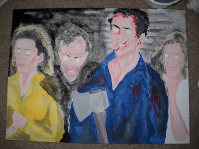
Here's a quick project I created on canvas board for the lovely BJC of Day of the Woman. She's a die-hard fan of the Evil Dead franchise and particularly Bruce Campbell. I'm convinced my butt-chin is the only saving grace of winning her attention. I decided to surprise her with a fun painting to help decorate her new digs, flashy and goofy and just plain fun.


Here's a pencil outline of the 4 characters from the Sam Raimi classic EVIL DEAD 2. This flick is just so much fun to watch. Whether you get held up in the camp of part one being better or vice versa, I do love the special effects make-up and Ted Raimi as Henrietta delivers one of my favorite performances besides his turn in DARKMAN. The canvas board you can pick up at Michael's or Pat Catan's. It's frame ready without needing to be stretched and you get like 6 to a package - perfect for practice and other fun projects.

I roughed in the outlines from a still from the movie and began laying down a base color to be added to as I went along. I left the pencil marks as a guide to brush over rather than erasing them and having to deal with smudges or going over with black marker or ink, which would show through under the acrylic paint.


I started building layers of color by mixing my whites and blacks with the colors I was working with as I went along. Yes, you can use pre-mixed colors that coordinate, but I believe that mixing in the moment is what gives your piece the personality it deserves. Plus it's cheaper too, and that's always a bonus.

I do like how using red and white really forces you to blend your flesh tones. You really have to have the patience and the fortitude to think ahead. Working with acrylic is a cheaper medium, but is far less forgiving it terms of blending. You can start to see a rough resemblance of what I am trying to achieve with the painting.


Next I went even darker, adding my blacks and reds. The shadows are an absolute pain in the ass, but like Burt Reynolds said in BOOGIE NIGHTS, "There's shadows in life, babe".

I did a light wash along the top with black mixed with water. Don't be afraid to experiment with texture. Here I used a paper towel to roll and smudge the colors together. Next up was my little coup de grace, the Zach special if you will...


I love how in the movie during this particular scene each actor is looking everywhere at their own pace. It's almost like the models of Robert Palmer's ADDICTED TO LOVE music video all dancing to their own rhythm. I decided to recreate that with Googly Eyes! They're hot glued on after a bit of black Sharpie to make my lines pop a bit more.


Here's the piece all said and done. I love that it's a bit more interactive as everyone I've shown it to immediately has to shake it to see the eyes in motion. It's a bit cartoony, but I really like it and I cranked it out in under two hours. I've been finding my patience for projects needs to be accelerated or I lose interest. That's not necessarily a bad thing, but everyone appreciates a lover with a slow touch a bit more, so I keep practicing and learning. Above all, I am trying to put the fun back into what I enjoy and I hope to share it more often with more people.


Here's another peak at it with a different bit of lighting. Not bad when compared to the film...


All in all it was a fun little romp of a project and forced me to practice my brushwork. You can call it fan-art if you want, I just call it a good time. Sure, I need to work on certain aspects (did you see those hands? Geeeeeez. It's like they're gonna wipe their ass with Gummy Worms.), but art is always about the journey, not the destination, right?

And if you haven't seen EVIL DEAD 2 yet, then what the hell is wrong with you? Seriously. I have the time to listen.

Monday, September 19, 2011

Lost Loves - Forgotten or Abandoned?

My friend Alex Foster is probably gonna end up as the next big shot producer in Hollywood, but once upon a time I made him a piece of artwork for his apartment when he was stuck with me on the East Coast.

I had found a walnut dresser door from a dumpster diving trip in Soho that was in perfect condition since it was being disassembled for the garbage trucks making their rounds. I snatched it up, brushed it off, and got plenty of odd looks on the subway carrying it home.

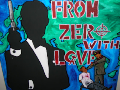
I wanted to draw some inspiration from my surroundings. Another friend had given me an old James Bond poster so I decided to play with that. I was also handed a flyer on the way home regarding the persecution of Falun Gong, which it didn't know much about, but the flyer included some striking imagery of human suffering that was too much to ignore.


I used a combination of acrylic paint, decoupage, and Sharpie marker. I decided to utilize the classic look of James Bond, which is almost an icon onto itself. I really enjoyed reading Ian Flemming's pulp fiction as a child and the books always resonated with me; political intrigue, foreign locales, bloody violence, beautiful women, and danger the world over. It's only now that I realize the true politics behind certain events and how they affect its citizens.


I really decided to rethink my understanding of James Bond as a character and what he reflects as a society. These elements of espionage and intrigue, but you never truly see the human suffering of the politics behind the curtain. Not much for movie entertainment, but it’s the basis of understanding the reasons and actions that would place a person in such a situation.


For the flesh tone of the tortured souls, it’s just the wood left exposed. I used a stencil for the star to help separate the piece into three distinct pieces as the eye follows downward. The text I wanted to play with and invoke the feel of a movie poster. The bottom half is a reflection of how all of this is treated like a game, where the players don’t even realize they’re the ones being played. The women at the bottom are actually one bondage image I found & printed from the computer of a cartoon fetish model in stockings and a gas mask. Here I meant to address the misogyny of suffering and the stories reported, whether through Hollywood or CNN, particularly in regards to gender.


It’s a strong, striking piece which is quite odd to take in and process. Sadly, Alex decided to get rid of the piece when he was moving because the paint started peeling off of the piece which he thought was a defect. It was meant to do this, to fade away and fall apart, adding another element to the painting. I meant to toy with the notion of how we can let suffering fade away as well as forget about the classics of Hollywood. This was definitely a piece of purging things from my brain, even if I didn’t completely understand it myself.


Here's another little side project I ended up giving to giving to a friend. I started this roughly 5 inch sculpture out of scrap copper wiring. The trick was sculpting it so that I would be able to fit it into its base container, but more of that later.


I molded into a rough shape of the figure and just used scrap pieces of plaster of Paris to make this little figure. After it was dry, I began blending out a flesh tone for the creature with acrylic paint. I wanted it to look somewhat humanoid yet alien.


After the acrylic was dry I coated the figure in about 3 coats of epoxy to give it a solid seal. After the seal was dry I placed the figure in a repurposed olive jar (just peeled the label & cleaned off the glue). I made a label for the figure using Microsoft word, printing it out and using spray adhesive on the backing. The project number refers to my birthday, the project name refers to ZERO which used to be my tag name. And if you can’t figure out Area 51, well that’s what Google is for folks.


I added the statue and added water to fill the jar. I knew that the weight of the piece would keep it from floating. I took one drop of white oil paint and added it to the water, giving it an odd swirl effect. After a little bit of time, some of the acrylic began to strip away and hang off like skin and would lightly sway if moved. Unfortunately I don’t know what happened to it in the end as I gave it to a friend who moved away and disappeared.


I definitely would like to try this project again, especially with materials such as latex, metal, and possibly on a much larger scale. But in the end I was quite pleased with it; not bad for something so creepy that still fits on the shelf of your refrigerator.


 I definitely would like to try this project again, especially with materials such as latex, metal, and possibly on a much larger scale. But in the end I was quite pleased with it; not bad for something so creepy that still fits on the shelf of your refrigerator.

Sunday, September 18, 2011

Can't we all get along?


Bill Adcock is a many of many talents, some known, somewhat hidden, and those entirely secreted away.I'm convinced he's part Highlander. He's the brains behind Radiation-Scarred Reviews as well as a contributor to the Blood Sprayer, and B Through Z Web-Zine. He had reached out wanting to commission me for a piece of artwork, to which I replied I would do it for a trade. His request was simple enough, left to the discretion of my imagination and delivery. The only stipulations were that it was painted and contain his specifically chosen subject matter: El Santo VS Yeti.

I definitely had my work cut out for me.


Now for this piece I had to come up with a couple different ideas to figure out the best way to represent the two iconic characters. Would they be locked in battle? Who would be the victor? I tried a few sketches, but they turned out crap. That's all part of the process.


I decided to remix it like a DJ, especially being inspired by these Star Wars posters I stumbled upon one sleepless night on the Net.


Once I had an idea for the format I decided to work on how I would depict the characters. Here's some Quick Google images of El Santo and a Yeti that I went for, kinda of like a bartender just grabbing bottles.


I worked on a flat canvas board that I actually broke down and bought. It's a matte treated canvas, but it's board thin, making it easier to transport and frame due to less weight. 


It was a step by step process in trying to create these figures.


I started to outline some of the main parts in Black Sharpie.


You can see how this makes it pop more, or at least for me. I'm a sucker for sharp black lines.


Working on the lettering was one part I simply dreaded.


To break up the piece and sell it as a "fight poster" I went with some curly-q razor wire, which is a lot harder to create than you'd realize.


I decided to lighten up the blue background to add more of a pop to the piece and began finishing off the lettering and other elements with black Sharpie.


Here's the final product. I'm pretty pleased with how it turned out, especially El Santo and the balance of the piece as a whole. The eye follows from top to bottom, left to right and it succeeds in looking less like art and more like something else.

I definitely need to work on my lettering. The Sharpie makes it pop and look like a real advert. I wish it had more of a letter press look to it rather than the hand-written style, but I could probably do that more so with stencils or maybe with a computer. I guess I always take the long way home.


Now it's time to jam out El Santo style...


Wednesday, February 9, 2011

Spending Christmas with The Creature from the Black Lagoon

Over the Christmas holidays, I had a chance to go rummaging with my father. I'm convinced he's part Gypsy as he can sniff out a bargain like a bloodhound. We went to visit a good buddy of his named Mokie, who is in the business of true wheeling & dealing. Mokie largely purchases lots from estate sales and storage units that have expired contracts and then auctions off the contents, sometimes for pennies on the dollar. The trick is you always have to check in and stop by. Half the fun is digging around for the diamond in the rough. I'm always a sucker for anything movie related, especially horror movies. One such visit I was able to snag this little gem of an art project.

The Creature from the Black Lagoon


Researching this online I found out that it's a re-release from March 1999 by Polar Lights of the original Revel model kit. This all plastic assembly kit is a replica of the originals sold long ago. It features all the same advertising as previously issued.

 This was the same classic set-up as years past. I had to twist the pieces apart and begin assembly with some epoxy I had left over. Here is the start of some of the pieces already assembled.

 Working with the epoxy meant having to glue and hold the limbs of the Gill Man just right while it dried. In the future I will definitely use a tube based glue instead of something you have to mix in equal parts.

 The only snag for the project was it didn't include a small snake that is supposed to wrap around the tree branch on the base. The whole thing is a forest green, which is meant to serve as a base for painting it in color, but I had a different idea in mind.

 I spray painted the entire thing in black. I then over-shot it (spraying from the top) with a dark gray spray paint. I then over-shot it with just a touch of white spray paint. Some of this white came out as spittle, dotting the piece like an old 35mm print.

Over-shot painting from the top allowed for the base coat of black to shine through like true shadows. I then took a black Sharpie marker and began to outline the ridges and raised edges of the Gill Man.

 I dotted some of the scales as well and outlined the face with Sharpie. This seems too harsh with all the black lines, but I wasn't quite done.

 I went back over the piece in a thin coat of acrylic white wash (white paint & water) about 2-3 times to blend down the tonality of the black Sharpie.

 These black lines help blend the seam lines left from the glue and such from the naked eye.

 I wanted the Creature to stand alone like the black & white classic film that I remember.

 I wanted the piece to look grainy, almost dirty - like a found print of the film itself.

 The whole kit almost weighs nothing at all, a few ounces at most, yet very durable. The epoxy I used is a great adhesive, my only issues were in applying it. I wouldn't recommend anything else with less strength.

 Here's a closer pic. The white, grey and black almost give it a slight bluish hue when photographed, but in person its just like out of the film.

The base is supposed to be some sort of a lagoon cavern with a large iguana and a skeleton hand sticking out of the crevice. I went back with black Sharpie and outlined the title that was sculpted into this piece.

All in all, it's been far too long since I've played with a model kit, they're quite a bit of fun. I'm eager to find a model shop soon and grab some more goodies. This would make for a great gift, pre-assembled or already put together. Click here to get your own. Click here for a whole gallery of Creature kits offered through time.