So I held a Art Contest Giveaway on my Twitter Zach for Zombies a while back and Geof of The Man Cave won. His prize was an original piece of artwork of anything he wanted. After spending a day drinking heavily watching sports he came up with my task; to create a wrestling match between the HARD ROCK ZOMBIES and the band KISS with JAWS (yes, the shark) as the referee. This death match would also have Pinhead of HELLRAISER, Freddy Krueger of NIGHTMARE ON ELM STREET, Jason Vorhees of FRIDAY THE 13TH, Ash of EVIL DEAD fame, and Mike Myers of HALLOWEEN as the lumberjacks outside the ring, poised to annihilate anyone that gets tossed over the ropes. Not a small task to accomplish by any means.
I started a few sketches in pencil on Bristol board, trying to figure out the best perspective to include all of these figures in one unified space. I knew the angle and the size of it all would determine how to proceed. I ultimately decided to tackle it straight on and use that very same angle. I went in after some sizing and started to add the details that would make each figure instantly recognizable.
Now I could understand the state of mind Geof was in when he thought this up, or I at least tried. I decided to use watercolors to give it a hazy, pseudo-comic book vibe. The trickiest part was depicting each character in it's limited scale and achieving each look that makes them so iconic. Watercolors are fairly unforgiving, but I enjoy working with the controlled chaos of how each color will ebb & flow. I then outlined different parts in Sharpie and fine point pen.
The piece is gritty and pretty ridiculous. Despite the challenge of creating it and the time it took, it was a lot of fun to experiment with such a mash-up of Geof's favorite films and influences and deliver a worthy prize. To do it again, I may would have tried acrylic or maybe even crayon.... You can check out Geof's unveiling post with video at The Man-Cave by clicking here.
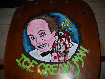
John Squires the beard and brains behind Freddy in Space commissioned me a while back on our field trip to Coney Island to see the Bruce Campbell Burlesque Tribute Show. He wanted a piece of horror themed artwork to decorate his new homestead that he had just moved into with his lovely girlfriend Jen. Johnny wanted a piece that celebrated the Clint Howard schlock fest known as ICE CREAM MAN. I said yes, of course and the wheels started to turn.
In researching how I wanted to craft this piece I remember I had the seat from an old wooden chair from college. The chair broke, but in such a way that the seat came out free and clear and I kept it knowing I was going to have to create something. It wasn't until John's request that I knew the genesis of this project. I would now embark on carving my first wood cut ever.
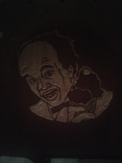
I used my girlfriend's carving tools to etch out a picture of Clint from the cover art of the film. I knew that I would have to think backwards in two ways with my work. 1) Whatever I carved away would be the negative space left behind, almost like drawing in reverse. 2) Anything I would use for this would be a reverse image when I pulled any prints off of it. Both of these things are something that's a lot harder to grasp in actual execution.
I got the carving to just about where I wanted it. The tricky thing with the seat was that I was trying to keep the image centered in the circular recess of the chair seat, you know the part you put your ass in. Then covered a small piece of cardboard I tore from a shipping box in smoothed aluminum foil and taped the edges underneath. I then squeezed out a quarter size of Speedball printing ink and used a small hand roller to start an even flowing layer of ink. You can find the ink and roller at just about any art store, and the ink has the same consistency as acrylic tube paint. Then I took the roller with an even coat of ink on it and rolled onto the wood. I had to be mindful of the divot, and I would suggest next time of only using a a FLAT board, but I digress. I have never pulled prints before, so there's a few valuable lessons I learned. The heavier stock paper you use is a bit more forgiving for beginners. I had a thinner piece tear on me as I was pulling it off. The thinner stock is a lot nicer for framing so there's the draw, it just requires a bit more patience and a steadier hand. You can find all kinds of specialty paper for printing at the art store as well. You don't want to go overboard with the ink as it will come out gloppy and too dark. Too light with the ink and it doesn't come out all the way. Some artists chase after a "Ghost Print", which is when you pull one print and have enough residual ink left over to simply apply another piece of paper.
I ended up pulling 9 prints in total, my favorite number. I decided that I was going to leave 3 as they were pulled and I decided to alter the remain 6 with spray paint and Sharpie to add a bit of variety.
The 3 I left unaltered are labeled #1-3 and signed. The others are all unique one of a kind variants. the last one actually has a hole in it that I plugged by gluing my business card on the back side as a way to double sign my work. Each of the altered prints are titled "Eye Scream #1-6" respectively.
Once I let the ink dry on the wood cut, I wanted to create a truly one and only piece. I was effectively going to destroy my plate, ensuring that no other prints could ever be pulled from it. I was going to paint over the seat in acrylic paint, which dries to a almost hard plastic. I set about building the flesh tones and then adding the other elements from the movie cover art that wasn't incorporated into the carving.
 |
| Here you can see the paint filling in the crevices from the recesses of the carving process. |
 |
Here's the finished piece, outlined in sharpie which proved like driving over road bumps when drawing the borders and carved areas. The title is smeared and drippy on purpose with a festering look about it. The whole project was a lot of fun to create, and I feel like I pushed myself into a new medium to deliver what was expected of me. This was my first commission piece so I felt obligated to go above and beyond. This is meant to be hung on the wall and Johnny also received all 9 prints with this piece.
You can check out Johnny's post with photos at Freddy in Space by clicking here. Rumor has it that he be holding a giveaway of his own....
Come back soon as I'll have even more projects to share.


as a wrestling fan I must confess, the Battle Royal piece is quite delightful.
ReplyDeleteAnd I am a huge fan of the Ice Cream Man, so kudos on your creation of him as well.
Keep up the great work!